Recently, we watched a film called 'Babette's Feast'. The story is focused around two Christian sisters living in the coast of west Jutland . Their lifestyle is incredibly simple. On a regular basis, they "dine" on bread and some sort of flat beer. Sometimes, they even mix the two creating mush that is to absolutely die for! No, in all seriousness, it didn't look like a fun time. Even the architecture of the region is simple - nothing but small white houses and their thatched roofs.
Nothing during this portion of the movie really drew my attention until a little ways in. Enter Babette. When large scale bloodshed breaks out, she arrives as a Parisian refugee to serve as the sisters' housemaid. Little do they know, she had once been a well-renowned chef in her city. Never once did she complain about the conditions; in fact, she bore great gratitude towards the sisters for taking her in. So when news arrived from France that Babette had won the lottery, she insisted on cashing it all in for a grand thank-you. In the end, Babette was able to pull together a dining experience, the likes of which would never had seemed possible the townsfolk before. She imported all the supplies from her old connections in Paris; only the best would do.
When the time of the feast came, I was honestly taken aback by the huge turnaround that was their dining space. Until now, we had become accustomed to seeing meager environments with wood bowls and tin silverware, not to mention splintering tables to match. They way Babette's dining space was set up was truly beautiful. All the lights in the room were doused, save four or five candles along the length of the table. This seemed to bring all the focus to the table itself as a symbol of union. That being said I believe that the true purpose of the movie is to understand the potential of any space. That's how you inspire design! Comprehend potential and you initiate progress.

Wednesday, February 9, 2011

Sunday, February 6, 2011
BP4: a testament to sir henry's big 3
"The end is to build well. Well building hath three conditions: firmness, commodity, and delight."
In Friday's class, we took a second tour of our UNCG campus, but with a much better understanding of our surroundings. This time, we discussed the buildings in relation to firmness, commodity, and delight. Based on what we saw, I definitely feel that the library offers a space which best identifies with these three characteristics of a "well building".
I feel firmness is a quality up for interpretation. This could relate to the power and solidity that a structure could imply based on its aesthetics. However, I believe that the quality I should be dealing with is the library's ability to stand the test of time. An excellent example representing the quality is the massive, circular stone entrance.
The library definitely fulfills its utility in the commodity department. The point of this structure is to contain knowledge, in hard copy form, of course, and simultaneously provide a place in which students have designated areas to focus on their work.
For me, nothing absolutely stands out in our library besides the entrance and the sloping walkway to the EUC building, which is often the most exciting part of the journey. In the end, it is just another generic library setup. There is no ingenuity. There is no heart. As a lesson in delight, I give you Louis Kahn's Exeter Library. A simple idea translated on a monumental scale. It is an interior which welcomes the viewer and manages to create a feeling of belonging throughout the library, with its beautiful circles. Lesson 2: In 2004, Rem Koolhaas designed the Seattle Public Library with a very unorthodox exterior. The coming together of such large geometric shapes is magical at this scale and the cross-hatched texture further heightens this sense of grandeur. Any given vantage point for either of these structures will absolutely hit you like a freight train of delight, filled with hamburgers. It's that good!
- Sir Henry Wotten, The Elements of Architecture
In Friday's class, we took a second tour of our UNCG campus, but with a much better understanding of our surroundings. This time, we discussed the buildings in relation to firmness, commodity, and delight. Based on what we saw, I definitely feel that the library offers a space which best identifies with these three characteristics of a "well building".
I feel firmness is a quality up for interpretation. This could relate to the power and solidity that a structure could imply based on its aesthetics. However, I believe that the quality I should be dealing with is the library's ability to stand the test of time. An excellent example representing the quality is the massive, circular stone entrance.
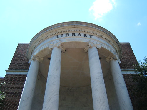 |
| view of library entrance. behold the majesty. |
The library definitely fulfills its utility in the commodity department. The point of this structure is to contain knowledge, in hard copy form, of course, and simultaneously provide a place in which students have designated areas to focus on their work.
 | ||
| silly students working when they could be could be engaging in (illegal) college behavior.. |
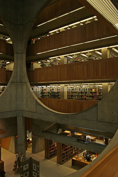 |
| Among Louis Kahn's Legacy. The Exeter. |
 |
| Rem Koolhaas' modern approach. Seattle Public. |
design manifesto of pure EPICness - theory 1
Over planning is the designer's demise. In this world of uncertainty, it is not uncommon for control-freaks to exist. They make futile attempts to determine how their everyday interactions will play out. They try to set the agenda. Translate this stressful lifestyle to a design project. There would have to be a perfect method for carrying out the design process. Most of the time would be spent on theory rather than practice. In the end, you will only serve to hinder and frustrate yourself beyond belief. So, my advice to you? Cut loose. You're trapped in a box. Break that sucker down! Even if you start with a fairly vague and unfocused idea, it'll gain intent and direction through executing the design process, rather than wasting time with the naive illusion of control.
Revert to a childish state of mind. A while ago, I read that children are closer to genius than anyone else, simply because they have not yet been tainted with wordly ideas. So, please, discard your fanciful notions that life is carbon-based, gravity is a universal law, and that you like cats. All you need to know is that the world is a magical and wonderful place. RELEASE THE KID IN YOU. Now, I unleash you upon society, free of your common-sense and knowledge which only served to tether you to rationality. Be unpredictable. Be unique. That is your calling and your gift. Go, my son/daughter. Go to Greatness.
Good work is not rushed. Long have we suffered, my brothers, under the unforgiving heel of our academic masters. These Professors seek to administrate our every action under pain of the 'F'. Who gives them the power to designate the dreaded 'due dates'? They act as if ordained by the gods. But no more, my brothers. This day we fight! This day we will decide of our own accord when assignments are finished; it is proven fact that rushed work is a fool's work.
Revert to a childish state of mind. A while ago, I read that children are closer to genius than anyone else, simply because they have not yet been tainted with wordly ideas. So, please, discard your fanciful notions that life is carbon-based, gravity is a universal law, and that you like cats. All you need to know is that the world is a magical and wonderful place. RELEASE THE KID IN YOU. Now, I unleash you upon society, free of your common-sense and knowledge which only served to tether you to rationality. Be unpredictable. Be unique. That is your calling and your gift. Go, my son/daughter. Go to Greatness.
Good work is not rushed. Long have we suffered, my brothers, under the unforgiving heel of our academic masters. These Professors seek to administrate our every action under pain of the 'F'. Who gives them the power to designate the dreaded 'due dates'? They act as if ordained by the gods. But no more, my brothers. This day we fight! This day we will decide of our own accord when assignments are finished; it is proven fact that rushed work is a fool's work.
Saturday, February 5, 2011

Thursday, February 3, 2011
color week(s)


v

 |
| My take on spring and summer, using Color-aid paper. For the spring, I kept it simple as its a time of rebirth and renewing the year. As time goes on, spring matures into summer, allowing for richer hues of color (orange and some brown.) |
 |
| The fall square is basically a study in contained chaos, reminiscent of falling leaves. Winter, however, is a break from everything leading up to it. All the growing richness and deepening hues up until fall are frozen over in the frigid color scheme I chose for that square. The sharp edges remind one of the harsh and unforgiving tone of this season. |
Monday, January 31, 2011

Sunday, January 30, 2011
BP3: UNCG and the big ten
In class we have been discussing the Acropolis and the Xianyang Palace. We created a list of Ten ideas to further explore them. These ten ideas are: space, power, experience, principles, precedent, site, order, scale, technology, surface. When one combines this knowledge base with the campus walk that we took similarities and evolutions become very evident. The use of circles, stacks, and groups or groves is almost always in use, regardless of the time period the building was constructed.
Space
Space
UNCG is designed, like any college campus, to promote education. It is geared towards making a student’s life easier by providing all of the necessary resources within a short walking distance. When all of the basic necessities are accounted for, it allows the student to focus on an education.
Power
Campus life does not necessarily instill power in the physical sense, but rather power of the mind. This comes through being able to fend for oneself without anyone’s help. This sense of independence builds self-confidence and mental dexterity that will last a lifetime. More than the lifestyle however, college provides for an invaluable education that, not only supplements independence, but is a major factor contributing to overall success down the road. In the end, it is safe to say that UNCG is fully dedicated to the empowerment of its students. Sir Francis Bacon once said, “Knowledge is Power.” I’d agree.
Experience
In class, we discussed the idea that only materials which were immediately available could be used for construction. However, in this day and age where distance is no longer a factor for acquiring materials, I believe the general spirit of architecture has shifted from pragmatism to aesthetics. Architects can choose whatever materials they please to give off a certain ambiance. In this case, just about all of the buildings are composed of brick, stone, and glass. The brick and stone are crucial to creating a monumental aura, while also giving a feeling of security to its patrons.
Principle
As a college campus, it is clear that an underlying principle behind the design is the relationship between students and the professor. Though the professor is always situated at the back of the room (in relation to the doorway), this end is understood to be the ‘front’. This idea in itself sets the professor up as an authority figure. The students occupy the middle area, facing him, to hear the story.

Precedent
Site
UNCG is located in Greensboro, North Carolina. This appeals to me personally, mainly because this doesn’t give me too long of a commute. Also, campus is not too far from downtown; this often comes in convenient when one wants to get off campus but stay in the vicinity.
Order
I believe UNCG has a very ordered campus, primarily because, of its high utility. By utility, I’m addressing the convenience and accessibility of resources. First off, the dorms are all clustered together, putting an emphasis on socialization among the student body. Going from the dorms, we find the student health center, the dining halls and the EUC, in that order. The most important buildings are in the closest vicinity of the living areas. Beyond that point are all the buildings where classes are held. From this arrangement, it is clear that UNCG was designed with utility and orderliness in mind.
Scale
Scale could refer to either the actual physical size of the campus or the availability of opportunities. However, I feel that the physical aspect is more relevant to our cause. Compared to an average-sized person, the buildings are quite massive.
Technology
Evidence of technology is clear just about everywhere on campus. Computers, vending machines, heck even cell phones change the way we experience campus. Unfortunately, these things only serve to eliminate the human aspect by making things impersonal and artificial. It is interesting, then, that something like a building could possibly bring this personal aspect back to the college experience. On many UNCG structures, there is evidence of Greek influences, most obviously in the columns. Columns are remind me of the Greek Titan, Atlas, who hold the sky upon his shoulders. To me, this is a very endearing notion. It gives the viewer a sense of welcome as if the building is being supported just for you to enter. Maybe I just think the world revolves around me, but whatever...

Evidence of technology is clear just about everywhere on campus. Computers, vending machines, heck even cell phones change the way we experience campus. Unfortunately, these things only serve to eliminate the human aspect by making things impersonal and artificial. It is interesting, then, that something like a building could possibly bring this personal aspect back to the college experience. On many UNCG structures, there is evidence of Greek influences, most obviously in the columns. Columns are remind me of the Greek Titan, Atlas, who hold the sky upon his shoulders. To me, this is a very endearing notion. It gives the viewer a sense of welcome as if the building is being supported just for you to enter. Maybe I just think the world revolves around me, but whatever...

Surface
The surface of campus is probably more horizontal than vertical for the most part. These aren't skyscrapers; the buildings span the surface much more than their rise.
The surface of campus is probably more horizontal than vertical for the most part. These aren't skyscrapers; the buildings span the surface much more than their rise.
Subscribe to:
Posts (Atom)