Thursday, April 28, 2011

unit 3 summary: explorations.

The final unit was about how everything we have learned up until this point comes together.  Moreover, its about how we will take this knowledge and run with it in the future.

It's important to understand that architecture is a global phenomenon which brings us all together one way or another.  This concept of globalization was first introduced in 1851, during the World's Fair at London's Crystal Palace.  People were able to view and be exposed to cultures from distant lands without ever leaving their backyards.  Unfortunately, the idea behind the fair was not to educate the populace on new ideas, but rather to show them their power position from a global standpoint.  It is arguable that this fair contributed to the beginning of the Age of Imperialism.


It was around this time that the crafts movement began taking root, what with the introduction of machinery.  Initially, artisans and designers feared that the machine would mean the end of their livelihoods.  It was soon realized that a machine is simply a tool to reduce labor and ultimately, costs.  However, that should mean that aesthetics should be sacrificed in the wake of cheap production.  Workers began mastering these new-found tools and over time, the underlying idea of  'good design for all' took root.

Women also played a crucial role with these developments.  To this point, they struggled with the idea that a woman's duty is to be mother first.  The outbreak of war, however, said otherwise.  The men were called away and in their absence, there was a labor deficit.  Women were called out from their homes to fuel the oversea war-machine.

Rosie the Riveter


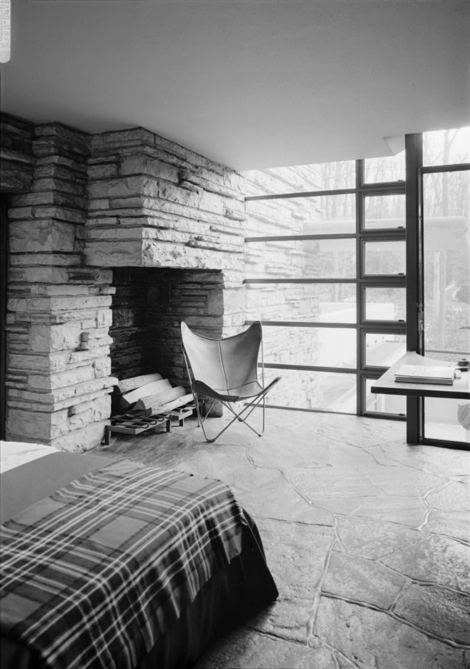
During the war, Americans were drawn to a new sociocultural trend: modernism.  Designers all around were in search of the perfect variation.  Basically, it was a cultural break from everything leading up to that point.  Some architects, like Ludwig mies van der Roe and Charles Le Corbusier, chose to stick with the simplicity of plain forms and color. 

As more designers joined the search for modernity, it eventually led to the movement of skyscraperism.  In cities, land grew increasingly expensive and a simple solution was vertical expansion.  We may as well call it Age of the Wu wu.  Particularly in Chicago, there was a huge influx of large building design.  Simultaneous production of the steel frame and elevator also made it possible.  Because of this concentration of ground-breaking design, Chicago is known, even today, for its attractive skyline.  By 1930s, however, the skyscraper movement found a new home in New York City with its completion of the Chrysler and Empire State Buildings, respectively. 

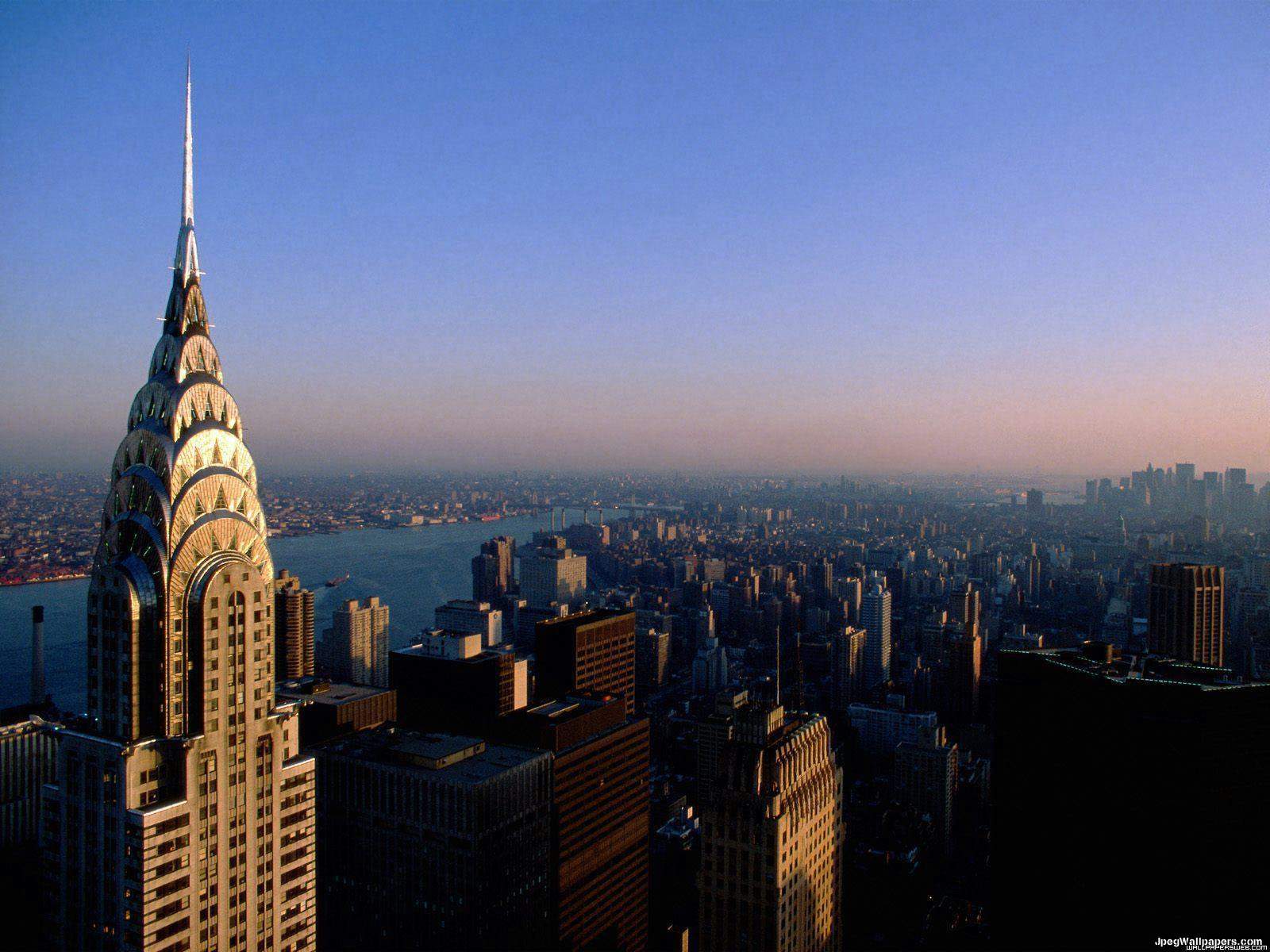
Chrysler building, NYC.

Empire State, NYC.

 In the end, it is safe to say that design is the offspring of circumstance.  New ideas and concepts emerge  where there is social or cultural change.  That's just the way ideas operate.  That being said, I have to say that I personally look forward to the avenue in which innovative design will lead us. 

BP 14


My favorite object would have to be Henrik Thor-Larsen’s Ovalia Egg chair.  When I first saw the movie, Men in Black, I remember thinking how absolutely awesome it was.  Returning to it after so long through chair cards only reinforced the awe-inspiring feeling of badassitude I once held for it.  It truly is unique in that it encases the seated creating a sense of security, but in a way that is much more aesthetically appealing, in my opinion, than other similar styles (i.e. the classic wing chair, Jacobsen’s Egg, or Saarinen’s Womb).


If there is anything I have abhor, architecturally speaking, it has to be wasted space.  I’ve got tons of respect for Gary Chang for this reason.  Chang lives in an apartment smaller than most people have ever seen, but he utilizes all of its space to great lengths with movable walls.  This not only allows for up to 24 different permutations, but is only a taste of what is possible when it comes to green architecture.

It would've kept out Chuck Norris in his prime...
And it's still a party pad.

I have a knack for taking things less-than-seriously.  It’s just the way I operate.  The other day, I found a guy who built a house for the sole purpose of repelling the ravenous undead.  That’s exactly what I would do! – take the relatively mundane task of constructing a house and warp it into something that would more than keep my full attention long after the completion of the project, in this case, a zombie-proof fortress!  The house features concrete sliding walls and a massive metal door which can slide into place when the beginning of the end arrives.  However, when its not in lockdown, the house is actually pretty appealing. 


New York City is a place that absolutely deserves a spot on top of my list, for both, sentimental value and architectural merit.  I was born in New Jersey with family in the city, so riding subways, exploring Manhattan, and hitting Times Square at New Years are all experiences I grew up with.  But enough about me; let’s talk buildings.  Be it the Chrysler, the Rockefeller, or the ever-impressive Empire State, New York City has plenty to brag about.

Wednesday, April 27, 2011

final project- writer's retreat at St. mary's

The idea for St. Mary's was to design an environment which would hearken to the needs of the writer.  If the writer is happy, you're happy.  For my space, I wanted to do something reminiscent of a New York city loft.  This idea was not clear at all, no focus, no direction.  I narrowed this down to specific ideas that I would incorporate into my space.  In the end, I chose exposed brick for some walls, and a loft with a low-hanging railing.  The rest of the space built up around these ideas. 


I wanted to keep the space casual as a whole; rules and boundaries are broken down further than in traditional buildings.  Throughout the house, there are casual beanbags lying around and comfortable seating, even in the office area.  I took this far enough as to incorporate hammocks in my loft.  In all living environments, however, there is a distinct division between public and private.  Given my inviting atmosphere, this seems almost hypocritical having solid boundaries to keep 'outsiders' out.  I whittled away at this idea of division.  In the wall shared by the office and the reading space, I added two windows and I widened the hallway leading to the rear rooms.  Also, I have lamps hanging down about 12 in the very same reading space.  This crosses through the plane of the loft and succeeds in uniting it with the lower level.  I'll admit that these are very subtle attempts at uniting the space as a whole, but it definitely does the job. 

view of the main seating area, along with the loft.

2 point view of the reading space. 

Monday, April 25, 2011

final presentation, yo!

Transverse section view showing portions from the writing room (left) and the bedroom area (right)


One pt. perspective depicting the view from the central area to writing and living spaces, as well a bit of the laundry room.  And yes, the scale figure's rockin' them boxers.

Monday, April 18, 2011

RR 13


Source: 
https://www.commerzbank.com/en/hauptnavigation/konzern/engagement/oekologie/oekologie.html

Sunday, April 17, 2011

BP 13


The legacy of Scandinavian modern drives us towards all things, simple yet aesthetically pleasing, cheap yet highly functional.  This type of design is sought after today because, it manages to blend all of these integral aspects of an excellent product so seamlessly.  Take Arne Jacobsen’s chairs for example.  They are all fairly simple in execution, but they still draw attention and interest. 

My personal favorite of his collection is the Egg chair of 1958.  
Said 'Egg chair'

Monday, April 11, 2011

RR 12

organic architecture. at its best.

       Coined by Frank Lloyd Wright, organic architecture is an idea first brought up in his writings.  The organic aspect of Fallingwater was intact before any construction even began.  When Wright first showed his plans to his client, the Kaufmans, they were surprised  that the house was located directly over the falls, rather than having a view of them.  Wright responded by saying that he wanted them to actually interact with them rather than viewing the falls from a distance.  This is exactly what organic architecture strives to do- integrate smoothly with its environment and complement it, rather than standing out as an independent object.  I feel that this concept is best exemplified in Wright's 1936 Fallingwater (and its only fitting what with the trip and all...). 


Year round, Fallingwater always delivers big.

    The exterior of Fallingwater is marked by the large, overhanging concrete terraces, reminiscent of the massive boulders pushing into the falls.  Interestingly enough, these same boulders push into the house at various locations.  One rock surface, for example, finds its way into the living room, making up the bottom of the fireplace and also a potential seat in another spot. 
stone floor. with rocks.


     Wright actually integrated Japanese style architecture when he designed this space.  One of the most dominant features of this are the low-hanging ceilings.  For the most part, the Fallingwater ceiling is around 6'6" to 7'.  That is unusually low for any space.  However, this does succeed in pulling the focus away from the interior and out the windows, reinforcing the house's connection to its surrounding natural environment.  


dressing room, west tower, second floor...low ceilings.


BP 12


     When I read the prompt for this week's blog post, I thought back to when that massive earthquake hit Japan a month ago.  At the time, I saw a video someone had posted online of the buildings in the Shinjuku district.  During the earthquake, the structures did sway in an unnerving fashion but the fact remains that the buildings all withstood a 9.0 quake, the biggest to hit Japan in recorded history! 


     I believe that for any building, interior aesthetics or even pragmatism should be secondary architectural concerns.  There is no point of such design if the structure cannot weather the elements it will inevitably be subjected to.  In this case, Japanese engineers were building in an area that attracts one-fifth of the world's earthquakes.  They prepared by cementing their structures with deep foundations and shock absorbers to negate seismic tremors.  These precautions saved thousands of lives, perhaps more.  This is, without a doubt, "good design for all".

Friday, April 8, 2011

Unit 2.

     Design can be defined very broadly: happiness, form, culture, function, music, and language, to name a few.  This is what we have come to understand through Unit 2.  Rules and guidelines have started coming into play.  Despite this, however, architecture over time goes through phases of abiding by and breaking the same rules.

     Take the Gothic period, for example.  Beginning in 12th Century France, it lasted for the next four hundred years.  During this period, architects forgot about tradition and began creating a brand new set of rules, resulting in some of the greatest churches and cathedrals in Europe.  The goal was to send structures as high as possible off of the ground to create a sense of majesty, while creating a link with the heavens.  Churches were important gathering and ceremonial spaces as shown by the grandeur of the interiors.  A prime example is the Amiens cathedral, built in France.  It is quite clear that the cathedral is the result of trial-and-error.  Never before had anything on such a grand scale been attempted and setbacks were all too common.  The original flying buttresses were placed too high around the choir and did nothing to counteract the outward force of the stacked stone.  A second set was later added to save the cathedral from collapsing in on itself.  A massive chain was also put in place around the mezzanine to prevent structural damage.

Flying buttresses as seen at Amiens cathedral.


     Following the Gothic period was the Renaissance, lasting from the 15th to early 17th Century.  Beginning in Florence, it quickly spread through all of Italy and ultimately, throughout Europe.  This was a period dedicated to revival, primarily early Greek and Roman revival, in both, concrete and abstract culture.  It's unique because, this period is dedicated entirely to bringing back what was once forgotten during Gothic experimentation.  There was also a certain clarity that was brought back into architecture; age-old ideas of groves and stacks were made obvious in design.  Built in the 15th Century, the Palazzo Medici demonstrates just that.  On the ground floor, there is a very evident roughness about the building.  The bricks are unwieldy and uncut, while doorways and windows are massive and bold.  This 'aggression' diminishes as the eye travels up the facade of the building into delicate and relatively intricate design upon the third floor.  These differences among the floors create a sense of stacking in the structure as a whole.  The window placement is reminiscent of groves.
Palazzo Medici.
     The period of Baroque architecture came following the Renaissance in the 16th Century.  In a nutshell, this style was all about cranking up Renaissance architecture to the next level.  It became common for Baroque to integrate the dramatic use of light, frescoes as ceiling art, as well as purposely incomplete architectural components.  Located in Italy, the Basilica of Superga is a church in the Baroque style.  It seems clear that the structure is a continuation from the Renaissance age.  However, the limits of what was accepted during that time are being pushed further.  The circular reception area as well as the dome seated above it are very daring but work to give the church a hip new feel to it.


     In Europe, there came a time where people faced religious persecution.  Religious difference was not the only thing looked down upon; all radical ideas were rejected, including architectural ones.  This brought an age of colonial architecture in the Americas.  Dutch, Spanish, French, German, and, English ideas architecture were all integrated across the 13 colonies.


Tuesday, April 5, 2011

Falling Water

     Even before going to Monticello or Fallingwater, I knew that I would appreciate the latter much more.  Granted, Monticello is a testament to the Roman neoclassical style, but, for me, its not really a style that I can appreciate too much beyond its architectural merit.  Fallingwater, on the other hand, is all about innovation.  Built in the 1930s, Frank Lloyd Wright's Fallingwater is built over a 30 foot waterfall.  This was part of the architect's attempt to unite his structure with the environment around it.  In the living room, for example, boulders surrounding the waterfall make their way into the flooring as if the house sprung up from the ground around it.  In some rooms, Wright has dropped the ceilings to draw the viewer's attention out of the window, once again, cementing the importance of nature in this space.  As the for the exterior, Fallingwater extends from just above the falls and up the adjacent hillside.  This allows it to comfortably sit in its plot of land and allowing the natural environment to push in from the borders.  Below, I've posted a sketch of Fallingwater from the lookout point.
quick sketch of Frank Lloyd Wright's Fallingwater from the lookout point