
Tuesday, December 6, 2011
blog 005
For the IOB, our lobby space will rely on both natural and artificial lighting. Sunlight will come in through the glass doors. To the left of the entrance, however, there will be a nook, which being surrounded by three walls, will have no sunlight in the space. It will rely on artificial lighting. From this area, on the upper left ceiling, there will be some spotlights shining down on the wall to lead patrons to the front desk.
Saturday, October 15, 2011
blog that 4
For our group project, we have tried to convert the overall feel of the IOB from artificial and uninviting to an environment that is open and welcoming to the community. Instead of what is there now, we are proposing a warm color scheme that will give emphasis to the unity within the space. As for design, our group settled on a hexagonal pattern that would repeat throughout the building. Since it is a design focused on helping with the disability of blindness, it is important that we do not become marginalized with a strictly visual design. Hence, textures. Our first response was to overlay various textures (wood grain, cork, chip board, etc) onto the design as it sat on the wall. However, we ended on a thought that the actual 2d shape can be bumped either out or into the wall, making it a 3d variation.
Thursday, September 29, 2011
the state of pop culture.
 The work to the right was done by Roger Shimamura. As an artist, he focuses on the experiences of Asian Americans.
 Growing up, Shimamura experienced the trauma of the Japanese-American internment camps during World War II and the social stigma and pariah-hood following their closure.
The original pikachu is originally a Japanese creation that has been indoctrinated by American pop culture, becoming a classic icon in our society. By superimposing his face onto the original image, Shimamura is putting a Japanese identity back onto a pop icon of Japanese origin. He reclaims 'Pikachu' from the bastardizing iron fist of American pop culture. This is my take on his work, even if it is slightly (a lot) more hardcore that its original message. Then again, art is always subject to interpretation.
hye yeon nam- a portrait.
When in DC, I came across a Korean artist by the name of Hye Yeon Nam. She has done several computer-based works, in which she carries out fairly simple tasks like walking and drinking. However, she does all of them with awkward difficulty because of her methods. In this particular video, "Self Portrait - Eating", Nam tries to eat a plateful of cherry tomatoes with an incredibly impractical tool, a ruler.
Initially, it seems like a statement about how we, as a species, have learned to utilize only the most pragmatic of methodology. Hye Yeon Nam is actually making a personal assertion, addressing the difficulties she faces everyday, as a Korean immigrant, trying to adapt to aspects of American culture.
I truly believe that her work is amazing. The content is both intriguing and genuine, but the messages behind her videos make the work all the more powerful in the end.
blog that 3
My first thought for presentations was to pick an architectural aspect of one of the three exhibits that I visited and base my talk around that. However, I realized that everyone would be doing something similar (which isn't too strange considering our major..). I then thought about the actual paintings and works within the museum walls. They are a huge part of what gives an exhibit life, beyond the calculated quality of architecture. In this way, they are integral to the architecture itself. I was the 6th speaker on presentation day, following Monica. I felt very confident in front of the audience so most of my talk came across very natural, as if it were a one-on-one conversation. I definitely provided the context for the pieces of art I discussed. Unfortunately, I cut
my talk short, as I blundered to a halt without a proper conclusion.
I did not visit the Speaking Center before I spoke. Honestly, speaking has never been an issue for me. It's something I've had to do many times growing up. Even the representative wasn't much use for me. Most of the things she talked about were things that I'd picked up some place or another. Really, one of the only things that needs major improvement is my ending. I got excited that the end was so close, said something 'bastardized pop culture' and passed the buck to Jon. It will be fixed by the next time.
Tuesday, September 20, 2011
blog that 2

After tedious lasso work, I was left me only with the focus of the original photograph: the sculpture and a couple of classmates. With the filters, angled strokes and cross-hatching, I stylized both, creating the dynamic rendering shown below. Once I had the main subject matter done properly, I felt that scale figures in my rendering were positioned awkwardly. I invoked artistic license, yet again, and moved the Jepperson figure off to the right, emphasizing the negative space underneath the structure.
I am a fan of the final product.

Sunday, September 11, 2011
future john
I do say 'future john' but don't get your hopes up; he isn't covered in flashy gear or anything like what we would expect in some advanced era. In this world, John has gone through a divorce, a failed business, and nothing's really gone right for the guy. The following is what John Jeppeson would look like if these events really got to him and he just stopped trying. This is a portrayal of John if he were some 300 pounds heavier. Keep in mind that this is merely conjecture so accuracy is impossible to judge.
 |
| I drew this flattering image on our first night in DC. I honestly believe that John should go for this size so I can judge for myself how true to life it is. |
summer trip. aferca 2011.
Towards the end of this past summer, my family and I went on a trip to Africa. We hit Uganda and then Tanzania for the last week. But Tanzania absolutely blew my mind. A safari generally has that effect. One of the places we drove through was an massive valley way up in the mountains called Ngorongoro Crater.
We basically drove up through the mountains on a sickening and narrow path until getting up to the rim, nearly 12000 feet over sea level. The fog here was incredibly thick, but whenever it was lucid, we were less than thrilled to be able to see the treacherous drop to our immediate right, while the left opened right up; you could see for some 10 miles out over sunlit plains before resting on the far edge of the rim beyond. It was here that our descent into the valley began.
The first thing I noticed was the rapid warming of the air around me. Temperatures shot up about 20 degrees when we reached the crater floor. It was a welcome change. The second was that the animals really didn't seem to care that much about us. Turns out, they've become completely accustomed to seeing all sorts of obnoxious tourists over the years in their armored land-rovers. Now, they don't care and nothing keeps them from wandering, some times inches away from your vehicle. This where the zebras came in.
 The zebras were the first fauna we came across in the crater. They saw our jeep approaching from a mile away but continued traveling across the road in a single file line. Even when we stopped 10 feet away. My sister snapped a shot of their voyage. I found it fascinating; this could find a place in National Geographic as far as I'm concerned. As you can see, there are several bands of color oriented in the same direction. The mountains, the clouds immediately above them, and the dark strip of savannah below would ordinarily be nothing special. Then this this harem of zebra comes seemingly out of nowhere, an indiscriminate point far off in the distance. By cutting through the parallel quality of the rest of the scenery, they take makes this picture beautiful.
We basically drove up through the mountains on a sickening and narrow path until getting up to the rim, nearly 12000 feet over sea level. The fog here was incredibly thick, but whenever it was lucid, we were less than thrilled to be able to see the treacherous drop to our immediate right, while the left opened right up; you could see for some 10 miles out over sunlit plains before resting on the far edge of the rim beyond. It was here that our descent into the valley began.
The first thing I noticed was the rapid warming of the air around me. Temperatures shot up about 20 degrees when we reached the crater floor. It was a welcome change. The second was that the animals really didn't seem to care that much about us. Turns out, they've become completely accustomed to seeing all sorts of obnoxious tourists over the years in their armored land-rovers. Now, they don't care and nothing keeps them from wandering, some times inches away from your vehicle. This where the zebras came in.

Saturday, September 10, 2011
blog that 1

The day we took the walk over to Industries of the Blind, I honestly had no idea what to expect. Only when we rounded the bend after the bridge did I realize that this was a building I had driven by for over a year and a half. The lettering at the time had meant nothing to me.


As we got closer, I appreciated how the building seemed to funnel people under the overhang until we were ushered into an even smaller lobby space. We then made our way up to the conference room. On the way up, I couldn’t help but notice and abhor the assortment of plastic plants placed haphazard underneath the stairwell. It was meant to be an area of relaxation, but at this point, everyone seemed to take the space for granted and it was as good as ignored.
 |
| stairwell to offices. |
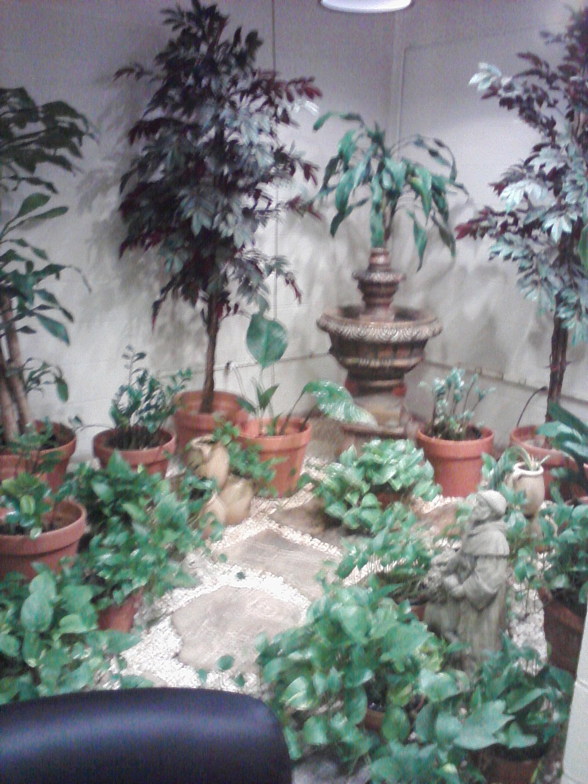 |
| zen area? |
Upstairs in the offices, the situation got no better for me. It was dull and sterile. Nothing stood out. The walls were white. The ceiling was lined by harsh ‘hospital’ lighting. Overall, it was just another cliché office area. In the actual conference room, the president of the company, David LoPresti took time to talk to our group. He went over the variety of amazing products that emerge from the factory floor, from the pen that writes underwater to the official neck guard of the army that saves lives on a daily basis.
 |
| reception area. |
 | |||
| conference room. |

 |
| factory floor. |
After a short diatribe, LoPresti began leading us through the factory floor. For the initial portion of the journey, I was fairly distant. That changed upon observing and meeting several of the actual workers. Many of them were considered legally blind, but they were performing tasks on complex machines, a feat that I cannot consider anything short of amazing. Not only that but, they were expected to perform at a high level of quality. LoPresti picked up a pair of gym pants and told how a single string out of place was reason enough to have the garment sent back for work. Had I been in charge, I feel that I wouldn’t be able to help but have a different attitude and more leniency towards my workers in light of their disabilities. However, that kind of attitude can be more detrimental than anything else. They are like anyone else and should be treated normally.
 |
| employee of the month (i forgot her name D:). |
 |
| but, she will be attending a conference for her outstanding work. :D |
 |
| the camo cutter. |
As we continued our tour, we were shown through a corridor that housed a massive precision fabric cutter. A giant roll of camo was being fished through a gap and the cutter was creating the same pattern in about every 12 feet of material. I had a hunch that this would be going towards military flak jackets. And once again, I was very impressed that this company was doing such important work for the soldiers out in the field.
One of the last rooms was particularly impressive. There were two rows of employees working on mounting the actual neck guard into fabric. That was nothing special. By now, I had also become accustomed to seeing disabled workers doing great things and this was no different. That was also normal. What blew me out of the water was the LED productivity sign. This room was running at 150 percent! That is amazing anywhere!
It was a collection of all of these experiences which gave me the respect that I have for the people in this company. They are truly beating the odds everday and in many cases, also the competition.
Thursday, September 8, 2011
a walk through ghm.
Voices Exhibit.
Upon first entering the Voices exhibit, the visitor must follow a curving path into a larger room. Along this path, there are quotes and phrases in different sizes, ornamenting the walls. This immediately gives the observer the vibe that these are the “voices” that are meant to be heard in the exhibit. When I first saw a timeline composed completely of pictures that related to major events in our past. It was quite interesting to see how Greensboro is connected to the rest of the nation in terms of these events. Honestly, I didn’t realize that our town played such an integral role in our country’s history. Also, it is natural for people to take our past for granted. That is why I appreciate the use of pictures rather than words in the timeline. It puts faces on events, making it easier to for us to appreciate our past. The rest of the Voices exhibit the different groups that settled in Greensboro over time. There was a particular focus on segregation and the struggle of African Americans to achieve equality. One point which caught my attention was the small exhibit for the Greensboro sit-ins. In 1960, four students sat down at a white-only counter and refused to leave until the store closed. Overall, the point of the exhibit was to portray Greensboro’s efforts to claim unity out of the dregs of institutionalized injustice. It is impossible to sum up an entire identity as an idea as brief as that, but that is what I will resort to. Greensboro is portrayed in the Voices exhibit as a growing socioeconomic center in the wake of a newly found harmony.
Period rooms and Pottery.
 |
| timeline. |
When it comes down to the pottery exhibit and the period rooms, I felt that the latter bested the former by far, in terms of interest level. When I first entered this area, I was immediately drawn to the pottery cases, simply because the harsh, artificial lighting demanded it. It makes sense that this is a good way to display objects, but you cannot ask for a more uninviting method of doing so. It completely sterilizes the pottery of its humanity. However, I do not quite know if this response is based on a dislike for the desensitizing display cases or my complete lack of interest in the pottery as subject matter. Perhaps a combination of the two. The period rooms, however, were a welcome diversion from the central pottery space. At the time, I remember appreciating the flow into that area, as an escape and refuge, anyway. The rooms around this outer circular area managed to revive that emotion that was stripped away moments ago. First off, the lighting was much softer than for the pottery. It makes it a much more natural way of experiencing a space, rather than exposing every nook and cranny to harsh hospital lighting. Early on, the light in the period rooms was nice, but as I made my way around the circle, it only managed to get dimmer and dimmer, to the point of barely being able to see anything in the last room. If anything should change, I would like it to be the consistency of lighting around this particular walk. When placed side by side with the pottery, the period rooms have a greater sense of identity. They give the observer a solid sense as to what the lifestyle may have been like in those spaces, whereas the pottery does nothing more than look pretty.
 | |||||||
| belle meade bedroom. |
Gate City.
The Gate City exhibit was quite enjoyable. I appreciated how it was essentially a large replica of an old town. It introduced an entirely new humanizing aspect to the space by making it one which can directly be experienced by the visitor. The first thing which caught my attention as I crossed through the glass doors was the ambiance. There are sounds playing in the background, contributing to the ‘entourage’ in the exhibit- honking cars, laughter, etc. At almost the same time, I noticed a large tree stationed in the center of the exhibit. On my left, I found a firehouse, a pharmacy, and a schoolhouse. In the schoolhouse, the representation of the teacher freaked me out. I understand that it’s supposed to make the area more relatable but that could have been right out of the Twilight Zone. When it comes to circulation for Gate City…well, there was none. All the mini exhibits surrounded a plaza area. After seeing one spot, the visitor bounces back to the plaza, resetting for another dive on another tangent. However, this makes the area unique, as the observer can create his own flow in the space. Circulation is a matter of preference. But is this chaos a welcome concept? Or should the visitor be led through the space in a meaningful manner? Overall, this space does make one want to believe that it be inhabited by a people. It has an identity that takes one back to the old times when Greensboro was first hitting industrial change.
 | ||
| druggist. |
Down Home.
“Down Home” was actually the first exhibit I visited, given its convenient location in relation to the entrance. I found the orientation of the glass cases interesting. They formed a circle, as if people were meant to earn access into closed off space. Then, the video, playing in loop, caught my attention. It drew me into the center of the circle and at once the exhibit made sense. That was my access point and it would allow a visitor to experience all the contents of the glass cases. However, it is still very clear that this is only a temporary exhibit. No special measures were taken to give the area a sense of completion. Just by placing the cases on one end of the lobby does not give it reason to be there. I feel that the surrounding walls in that area of the lobby had a very particular set of edges. That being said, it would have been nice if the placement of the cases were based off of this setup. The actual merit of the exhibit’s information, on the other hand, is quite a different story. It follows the Jewish community in Greensboro, elaborating on the pride they felt for having faced and overcome the social struggles they faced. Through these experiences, the Greensboro Jewish community has forged an identity that, while unique, still can be united with the rest of our local society. There is no point in having a distinct culture if it is unable to unite with its surroundings.
 |
| video and dress. |
Wednesday, September 7, 2011
project placement...(WAM, IOB, or GHM)
What project do you feel you can most contribute to?
I feel that I could do the most on the Industries of the Blind project. The space has quite a bit of potential and I feel I could do a good job helping it reach that peak.
Where do you see your skills carrying into this group work?
Initially, I feel that my quick sketching and diagramming skills will allow the group to go through many ideas in a short period of time. Later on in the project, I believe that I also have a good sense as to what makes for a good composition. This would come in handy when dealing with the board layout.

Friday, September 2, 2011


Wednesday, August 31, 2011
weatherspoon diagram.

2. Obelisk structure..
3. Transition from narrow foyer space to wide, open Weatherspoon lobby.
4. Painting on far wall.
5. Four adjacent windows draw attention.
6. Stairway to heaven...no, not really. It goes to the second floor.
It'd been a rough morning. Half an hour after I should have been out the door, I found myself struggling to get up. 7 : 43, the clock said. It took a while, but eventually I found the will to take a shower, grab a coffee, and drive to work. At that point, I remembered we had a new boss moving in, a guy promoted straight out of the mail room. Sure, it made no sense, but that would just mean that he'd have to earn respect by breaking some heads. My head. Screw it, I thought, if I'm already in for some verbal abuse, I'll kill the whole morning.
With that, I happened to drive by the UNCG campus. I saw Weatherspoon from my car window. Yes, that'll do nicely. Parked. After a short walk across the parking lot, I came to the back gate, a massive black pair of metal doors, both swung wide open. It almost felt like facing an authority; I had to be humbled before earning the rite of passage. Like a new boss. I went in with disgust. My attitude began evaporating almost instantly in the courtyard. The whole ambiance of the space was pleasant. Sculptures all around. One in particular caught my eye. A tall metal obelisk on my left. Beyond it, I saw a covered walkway leading into the actual museum. Figuring that this was the natural way that a visitor would experience the space, I followed the path and found myself in the foyer space. It felt very unnatural and constricting in this space. Low ceilings. I felt like getting out. An exit straight ahead. Forcing open the doors, I found myself in the Weatherspoon lobby. It was an excellent feeling getting into such an open space. It was liberating. I was free. My eyes followed the delicate series of sculptures lining the lip of the oval above. I was lost in this circular experience of art. And then it hit my like a ton of bricks. My job sucked. I was working a dead end job. My girlfriend was sleeping with the custodian. I was going to get fired anyway.
Feeling mixed emotions of hope and despair, I saw a solution. I'm worth more than this! With that parting thought, I made my way up the staircase. My life changes NOW.
Thursday, April 28, 2011
unit 3 summary: explorations.
The final unit was about how everything we have learned up until this point comes together. Moreover, its about how we will take this knowledge and run with it in the future.
It's important to understand that architecture is a global phenomenon which brings us all together one way or another. This concept of globalization was first introduced in 1851, during the World's Fair at London's Crystal Palace. People were able to view and be exposed to cultures from distant lands without ever leaving their backyards. Unfortunately, the idea behind the fair was not to educate the populace on new ideas, but rather to show them their power position from a global standpoint. It is arguable that this fair contributed to the beginning of the Age of Imperialism.

It was around this time that the crafts movement began taking root, what with the introduction of machinery. Initially, artisans and designers feared that the machine would mean the end of their livelihoods. It was soon realized that a machine is simply a tool to reduce labor and ultimately, costs. However, that should mean that aesthetics should be sacrificed in the wake of cheap production. Workers began mastering these new-found tools and over time, the underlying idea of 'good design for all' took root.
Women also played a crucial role with these developments. To this point, they struggled with the idea that a woman's duty is to be mother first. The outbreak of war, however, said otherwise. The men were called away and in their absence, there was a labor deficit. Women were called out from their homes to fuel the oversea war-machine.
During the war, Americans were drawn to a new sociocultural trend: modernism. Designers all around were in search of the perfect variation. Basically, it was a cultural break from everything leading up to that point. Some architects, like Ludwig mies van der Roe and Charles Le Corbusier, chose to stick with the simplicity of plain forms and color.
As more designers joined the search for modernity, it eventually led to the movement of skyscraperism. In cities, land grew increasingly expensive and a simple solution was vertical expansion. We may as well call it Age of the Wu wu. Particularly in Chicago, there was a huge influx of large building design. Simultaneous production of the steel frame and elevator also made it possible. Because of this concentration of ground-breaking design, Chicago is known, even today, for its attractive skyline. By 1930s, however, the skyscraper movement found a new home in New York City with its completion of the Chrysler and Empire State Buildings, respectively.
In the end, it is safe to say that design is the offspring of circumstance. New ideas and concepts emerge where there is social or cultural change. That's just the way ideas operate. That being said, I have to say that I personally look forward to the avenue in which innovative design will lead us.
It's important to understand that architecture is a global phenomenon which brings us all together one way or another. This concept of globalization was first introduced in 1851, during the World's Fair at London's Crystal Palace. People were able to view and be exposed to cultures from distant lands without ever leaving their backyards. Unfortunately, the idea behind the fair was not to educate the populace on new ideas, but rather to show them their power position from a global standpoint. It is arguable that this fair contributed to the beginning of the Age of Imperialism.
It was around this time that the crafts movement began taking root, what with the introduction of machinery. Initially, artisans and designers feared that the machine would mean the end of their livelihoods. It was soon realized that a machine is simply a tool to reduce labor and ultimately, costs. However, that should mean that aesthetics should be sacrificed in the wake of cheap production. Workers began mastering these new-found tools and over time, the underlying idea of 'good design for all' took root.
Women also played a crucial role with these developments. To this point, they struggled with the idea that a woman's duty is to be mother first. The outbreak of war, however, said otherwise. The men were called away and in their absence, there was a labor deficit. Women were called out from their homes to fuel the oversea war-machine.
 |
| Rosie the Riveter |
During the war, Americans were drawn to a new sociocultural trend: modernism. Designers all around were in search of the perfect variation. Basically, it was a cultural break from everything leading up to that point. Some architects, like Ludwig mies van der Roe and Charles Le Corbusier, chose to stick with the simplicity of plain forms and color.
As more designers joined the search for modernity, it eventually led to the movement of skyscraperism. In cities, land grew increasingly expensive and a simple solution was vertical expansion. We may as well call it Age of the Wu wu. Particularly in Chicago, there was a huge influx of large building design. Simultaneous production of the steel frame and elevator also made it possible. Because of this concentration of ground-breaking design, Chicago is known, even today, for its attractive skyline. By 1930s, however, the skyscraper movement found a new home in New York City with its completion of the Chrysler and Empire State Buildings, respectively.
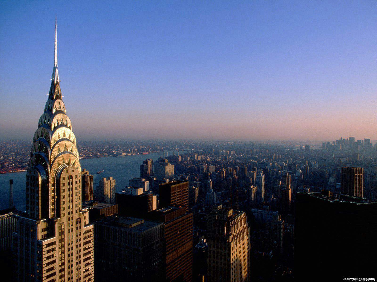 | ||
| Chrysler building, NYC. |
 |
| Empire State, NYC. |
In the end, it is safe to say that design is the offspring of circumstance. New ideas and concepts emerge where there is social or cultural change. That's just the way ideas operate. That being said, I have to say that I personally look forward to the avenue in which innovative design will lead us.
BP 14

My favorite object would have to be Henrik Thor-Larsen’s Ovalia Egg chair. When I first saw the movie, Men in Black, I remember thinking how absolutely awesome it was. Returning to it after so long through chair cards only reinforced the awe-inspiring feeling of badassitude I once held for it. It truly is unique in that it encases the seated creating a sense of security, but in a way that is much more aesthetically appealing, in my opinion, than other similar styles (i.e. the classic wing chair, Jacobsen’s Egg, or Saarinen’s Womb).
If there is anything I have abhor, architecturally speaking, it has to be wasted space. I’ve got tons of respect for Gary Chang for this reason. Chang lives in an apartment smaller than most people have ever seen, but he utilizes all of its space to great lengths with movable walls. This not only allows for up to 24 different permutations, but is only a taste of what is possible when it comes to green architecture.
 |
| It would've kept out Chuck Norris in his prime... |
 |
| And it's still a party pad. |
I have a knack for taking things less-than-seriously. It’s just the way I operate. The other day, I found a guy who built a house for the sole purpose of repelling the ravenous undead. That’s exactly what I would do! – take the relatively mundane task of constructing a house and warp it into something that would more than keep my full attention long after the completion of the project, in this case, a zombie-proof fortress! The house features concrete sliding walls and a massive metal door which can slide into place when the beginning of the end arrives. However, when its not in lockdown, the house is actually pretty appealing.

New York City is a place that absolutely deserves a spot on top of my list, for both, sentimental value and architectural merit. I was born in New Jersey with family in the city, so riding subways, exploring Manhattan, and hitting Times Square at New Years are all experiences I grew up with. But enough about me; let’s talk buildings. Be it the Chrysler, the Rockefeller, or the ever-impressive Empire State, New York City has plenty to brag about.
Wednesday, April 27, 2011
final project- writer's retreat at St. mary's
The idea for St. Mary's was to design an environment which would hearken to the needs of the writer. If the writer is happy, you're happy. For my space, I wanted to do something reminiscent of a New York city loft. This idea was not clear at all, no focus, no direction. I narrowed this down to specific ideas that I would incorporate into my space. In the end, I chose exposed brick for some walls, and a loft with a low-hanging railing. The rest of the space built up around these ideas.

I wanted to keep the space casual as a whole; rules and boundaries are broken down further than in traditional buildings. Throughout the house, there are casual beanbags lying around and comfortable seating, even in the office area. I took this far enough as to incorporate hammocks in my loft. In all living environments, however, there is a distinct division between public and private. Given my inviting atmosphere, this seems almost hypocritical having solid boundaries to keep 'outsiders' out. I whittled away at this idea of division. In the wall shared by the office and the reading space, I added two windows and I widened the hallway leading to the rear rooms. Also, I have lamps hanging down about 12 in the very same reading space. This crosses through the plane of the loft and succeeds in uniting it with the lower level. I'll admit that these are very subtle attempts at uniting the space as a whole, but it definitely does the job.

I wanted to keep the space casual as a whole; rules and boundaries are broken down further than in traditional buildings. Throughout the house, there are casual beanbags lying around and comfortable seating, even in the office area. I took this far enough as to incorporate hammocks in my loft. In all living environments, however, there is a distinct division between public and private. Given my inviting atmosphere, this seems almost hypocritical having solid boundaries to keep 'outsiders' out. I whittled away at this idea of division. In the wall shared by the office and the reading space, I added two windows and I widened the hallway leading to the rear rooms. Also, I have lamps hanging down about 12 in the very same reading space. This crosses through the plane of the loft and succeeds in uniting it with the lower level. I'll admit that these are very subtle attempts at uniting the space as a whole, but it definitely does the job.
 |
| view of the main seating area, along with the loft. |
 |
| 2 point view of the reading space. |
Monday, April 25, 2011
final presentation, yo!
| Transverse section view showing portions from the writing room (left) and the bedroom area (right) |
| One pt. perspective depicting the view from the central area to writing and living spaces, as well a bit of the laundry room. And yes, the scale figure's rockin' them boxers. |
Monday, April 18, 2011
RR 13

Source:
https://www.commerzbank.com/en/hauptnavigation/konzern/engagement/oekologie/oekologie.html
Sunday, April 17, 2011
BP 13
The legacy of Scandinavian modern drives us towards all things, simple yet aesthetically pleasing, cheap yet highly functional. This type of design is sought after today because, it manages to blend all of these integral aspects of an excellent product so seamlessly. Take Arne Jacobsen’s chairs for example. They are all fairly simple in execution, but they still draw attention and interest.
My personal favorite of his collection is the Egg chair of 1958.
 |
| Said 'Egg chair' |
Monday, April 11, 2011
RR 12
organic architecture. at its best.
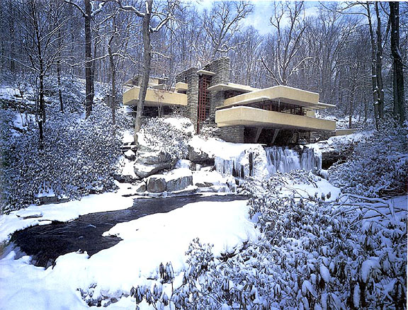
Coined by Frank Lloyd Wright, organic architecture is an idea first brought up in his writings. The organic aspect of Fallingwater was intact before any construction even began. When Wright first showed his plans to his client, the Kaufmans, they were surprised that the house was located directly over the falls, rather than having a view of them. Wright responded by saying that he wanted them to actually interact with them rather than viewing the falls from a distance. This is exactly what organic architecture strives to do- integrate smoothly with its environment and complement it, rather than standing out as an independent object. I feel that this concept is best exemplified in Wright's 1936 Fallingwater (and its only fitting what with the trip and all...).
The exterior of Fallingwater is marked by the large, overhanging concrete terraces, reminiscent of the massive boulders pushing into the falls. Interestingly enough, these same boulders push into the house at various locations. One rock surface, for example, finds its way into the living room, making up the bottom of the fireplace and also a potential seat in another spot.
Wright actually integrated Japanese style architecture when he designed this space. One of the most dominant features of this are the low-hanging ceilings. For the most part, the Fallingwater ceiling is around 6'6" to 7'. That is unusually low for any space. However, this does succeed in pulling the focus away from the interior and out the windows, reinforcing the house's connection to its surrounding natural environment.
 |
| Year round, Fallingwater always delivers big. |
 |
 |
| stone floor. with rocks. |
Wright actually integrated Japanese style architecture when he designed this space. One of the most dominant features of this are the low-hanging ceilings. For the most part, the Fallingwater ceiling is around 6'6" to 7'. That is unusually low for any space. However, this does succeed in pulling the focus away from the interior and out the windows, reinforcing the house's connection to its surrounding natural environment.
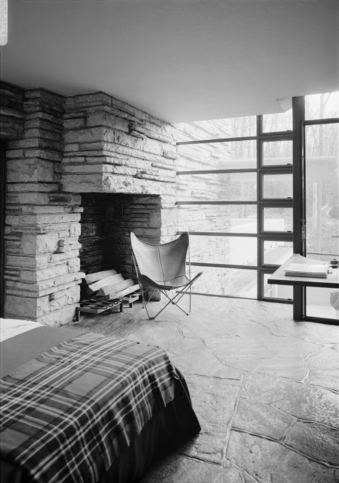 |
| dressing room, west tower, second floor...low ceilings. |
BP 12
I believe that for any building, interior aesthetics or even pragmatism should be secondary architectural concerns. There is no point of such design if the structure cannot weather the elements it will inevitably be subjected to. In this case, Japanese engineers were building in an area that attracts one-fifth of the world's earthquakes. They prepared by cementing their structures with deep foundations and shock absorbers to negate seismic tremors. These precautions saved thousands of lives, perhaps more. This is, without a doubt, "good design for all".
Friday, April 8, 2011
Unit 2.
Design can be defined very broadly: happiness, form, culture, function, music, and language, to name a few. This is what we have come to understand through Unit 2. Rules and guidelines have started coming into play. Despite this, however, architecture over time goes through phases of abiding by and breaking the same rules.
Take the Gothic period, for example. Beginning in 12th Century France, it lasted for the next four hundred years. During this period, architects forgot about tradition and began creating a brand new set of rules, resulting in some of the greatest churches and cathedrals in Europe. The goal was to send structures as high as possible off of the ground to create a sense of majesty, while creating a link with the heavens. Churches were important gathering and ceremonial spaces as shown by the grandeur of the interiors. A prime example is the Amiens cathedral, built in France. It is quite clear that the cathedral is the result of trial-and-error. Never before had anything on such a grand scale been attempted and setbacks were all too common. The original flying buttresses were placed too high around the choir and did nothing to counteract the outward force of the stacked stone. A second set was later added to save the cathedral from collapsing in on itself. A massive chain was also put in place around the mezzanine to prevent structural damage.

Following the Gothic period was the Renaissance, lasting from the 15th to early 17th Century. Beginning in Florence, it quickly spread through all of Italy and ultimately, throughout Europe. This was a period dedicated to revival, primarily early Greek and Roman revival, in both, concrete and abstract culture. It's unique because, this period is dedicated entirely to bringing back what was once forgotten during Gothic experimentation. There was also a certain clarity that was brought back into architecture; age-old ideas of groves and stacks were made obvious in design. Built in the 15th Century, the Palazzo Medici demonstrates just that. On the ground floor, there is a very evident roughness about the building. The bricks are unwieldy and uncut, while doorways and windows are massive and bold. This 'aggression' diminishes as the eye travels up the facade of the building into delicate and relatively intricate design upon the third floor. These differences among the floors create a sense of stacking in the structure as a whole. The window placement is reminiscent of groves.
The period of Baroque architecture came following the Renaissance in the 16th Century. In a nutshell, this style was all about cranking up Renaissance architecture to the next level. It became common for Baroque to integrate the dramatic use of light, frescoes as ceiling art, as well as purposely incomplete architectural components. Located in Italy, the Basilica of Superga is a church in the Baroque style. It seems clear that the structure is a continuation from the Renaissance age. However, the limits of what was accepted during that time are being pushed further. The circular reception area as well as the dome seated above it are very daring but work to give the church a hip new feel to it.

In Europe, there came a time where people faced religious persecution. Religious difference was not the only thing looked down upon; all radical ideas were rejected, including architectural ones. This brought an age of colonial architecture in the Americas. Dutch, Spanish, French, German, and, English ideas architecture were all integrated across the 13 colonies.
Take the Gothic period, for example. Beginning in 12th Century France, it lasted for the next four hundred years. During this period, architects forgot about tradition and began creating a brand new set of rules, resulting in some of the greatest churches and cathedrals in Europe. The goal was to send structures as high as possible off of the ground to create a sense of majesty, while creating a link with the heavens. Churches were important gathering and ceremonial spaces as shown by the grandeur of the interiors. A prime example is the Amiens cathedral, built in France. It is quite clear that the cathedral is the result of trial-and-error. Never before had anything on such a grand scale been attempted and setbacks were all too common. The original flying buttresses were placed too high around the choir and did nothing to counteract the outward force of the stacked stone. A second set was later added to save the cathedral from collapsing in on itself. A massive chain was also put in place around the mezzanine to prevent structural damage.
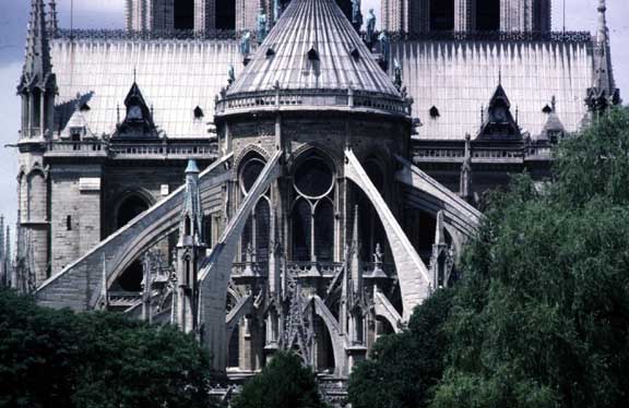 |
| Flying buttresses as seen at Amiens cathedral. |
Following the Gothic period was the Renaissance, lasting from the 15th to early 17th Century. Beginning in Florence, it quickly spread through all of Italy and ultimately, throughout Europe. This was a period dedicated to revival, primarily early Greek and Roman revival, in both, concrete and abstract culture. It's unique because, this period is dedicated entirely to bringing back what was once forgotten during Gothic experimentation. There was also a certain clarity that was brought back into architecture; age-old ideas of groves and stacks were made obvious in design. Built in the 15th Century, the Palazzo Medici demonstrates just that. On the ground floor, there is a very evident roughness about the building. The bricks are unwieldy and uncut, while doorways and windows are massive and bold. This 'aggression' diminishes as the eye travels up the facade of the building into delicate and relatively intricate design upon the third floor. These differences among the floors create a sense of stacking in the structure as a whole. The window placement is reminiscent of groves.
 |
| Palazzo Medici. |
In Europe, there came a time where people faced religious persecution. Religious difference was not the only thing looked down upon; all radical ideas were rejected, including architectural ones. This brought an age of colonial architecture in the Americas. Dutch, Spanish, French, German, and, English ideas architecture were all integrated across the 13 colonies.
Tuesday, April 5, 2011
Falling Water
Even before going to Monticello or Fallingwater, I knew that I would appreciate the latter much more. Granted, Monticello is a testament to the Roman neoclassical style, but, for me, its not really a style that I can appreciate too much beyond its architectural merit. Fallingwater, on the other hand, is all about innovation. Built in the 1930s, Frank Lloyd Wright's Fallingwater is built over a 30 foot waterfall. This was part of the architect's attempt to unite his structure with the environment around it. In the living room, for example, boulders surrounding the waterfall make their way into the flooring as if the house sprung up from the ground around it. In some rooms, Wright has dropped the ceilings to draw the viewer's attention out of the window, once again, cementing the importance of nature in this space. As the for the exterior, Fallingwater extends from just above the falls and up the adjacent hillside. This allows it to comfortably sit in its plot of land and allowing the natural environment to push in from the borders. Below, I've posted a sketch of Fallingwater from the lookout point.
 |
| quick sketch of Frank Lloyd Wright's Fallingwater from the lookout point |
Subscribe to:
Posts (Atom)