Monday, February 28, 2011

RR 7 - Feb 28

     It is a very common phenomenon in ancient architecture that the materials used in any building are clearly found in a close vicinity to said building.  Nowhere is this idea more pronounced and accurate than in the Mosques of Mali.  Mali is a landlocked country edging into Sahara Desert from the south.  Based on this information, it is logical that early architects would have to make do with what is immediately available: ferey, or sun-baked mud bricks.  A type of mud plaster held the bricks together and was even coated on top of the finished building for an organic, smooth look.  Despite its simple design, this is an example of architecture that absolutely belongs where it stands.  In a perfect world, it would have risen from the sands in that form.


     Originally built in 1327, the Djinguereber Mosque is the oldest of these mosques.  It features two minarets, three inner courts, and hall with over 20 rows of pillars.  This massive space can contain up to two thousands people.  A very unique aspect must be addressed about this type of building.  Upon the surface, there are rows and rows of wooden logs protruding from the otherwise smooth mud surface.  At one point, they served as scaffolding during construction but now, they are integrated into its very design.  Clearly, Malians had this process figured out, unlike European architects.  For example, Gothic cathedrals were essentially built twice, once as wooden scaffolding, then again, as stone structure.
European scaffolding
Malian scaffolding


A drawback of this type of construction, however, is the wind erosion constantly cutting away at the surfaces.  It becomes necessity to counter this with constant maintenance.

Sunday, February 27, 2011

BP 7 - Feb 28

     Ideally, all architecture is meant to create a connection with the viewer by evoking some kind of emotional response.  For the most part, I can positively say that the expected emotion is actually happiness.  Spaces should not only shelter its viewer but also create environments which promote interactions within that space.  Personally, however, I believe that a space's ability to provide happiness is an absolutely crucial tenet in any architectural space.
     If I had to identify a space which provides happiness for me, it wouldn't actually be any room in a building.  I chose the magnolia on the corner of College Avenue and Administration Drive.  I was very unaware of the space hidden within this giant shrub. On the side facing Spring Garden, there is an opening.  Until Friday, I was unaware of its existence.  I walked into the gap half expecting to be disappointed by a small, unappealing space.  Quite the opposite.  The tree has grown to such a scale that its massive branches extend a good 10 feet from the trunk of the tree without any cumbersome leafy growth to fill the gap.  Light actually filters down through the leaves giving a off a beautiful aura and a sense of mystery about the place.  A single tire swing hangs amidst the branches, suggesting that the tranquility of the place peaks at one's solitude in it.  Here, you can leave behind the issues of the world and experience happiness in the simpler things of life.  Return to easier times.  In this sanctuary, there are no papers due.  Blog posts are thing of the past.  Tests are overrated.  And you? Well, you're just a kid in a tire swing.

Wednesday, February 16, 2011

smelloscope - the age of stench.


In this age of technology, we work hard to eliminate the human experience.  Everything's all about pixels and gizmos.  We have come to embrace isolation, our only portal to the outside world being a 1'x1.5' LCD screen.


So I say, what the hell! Everyone's doing it!  Embrace the isolation.  I mean, after all, it's just a part of life, right?  I do have a partial solution, however, that contributes this big lie you've built up around yourself.  I call it 'The Smelloscope'!

We've gotten to the point where can transmit sound over huge distances.  We've even managed visual display.  But no one's ever pulled off the digitization of a smell, stench, or even fragrance!  That's where I come in.  The Smelloscope is a state-of-the-art model with USB capability.  Just hook it up and you're good to go!

But that's not even the best part - we're letting these Smelloscope towers go for only $8.99! That's right! It's yours for only $8.99 - plus shipping and handling.  How so cheap? Well I'll tell ya.  It's literally just cardboard and a bit of masking tape.  A spritz of black paint and it's straight to the shelf.  The finishing touch is a cut USB cord that lead deceptively into the base of the tower.  And people think it works!

...Ehem, I've said too much, but seriously, try it and you'll see that the Smelloscope is right for you!

Tuesday, February 15, 2011

'dining together day'...an tale of triumph


     In this new age of technology, we have been faced with the social epidemic of isolation.  As it is, we stand separated by nationality, race, language, creed; all of which mean nothing in the global sense.  We treat these invisible barriers as concrete boundaries, becoming all too comfortable as a divided people.   In 2015, the United Nations found a solution in the form of “Dining Together Day”, as they so eloquently dubbed it.  On this day, people worldwide gather by means of the internet, dropping all differences, to embrace each other’s cultures as a single family. 
     Back when it was first instated, the proposal was met with much resistance; change is an unnerving thing.  Now, eight and a half decades later, we have long dropped this pessimism.  Twice a year, families around the globe look forward to sharing traditions with the same families they were assigned way back in 2015.  My great-great grandparents may have taken the news grudgingly, but these are people I have seen grow up from infancy and start families of their own.  There are Kago’s and Teo’s families in East Africa, the Matsukis in Japan, Aalbert back in Holland, and Suki and her girlfriend in Hong Kong.  She came out last year; that was quite exciting for all of us.
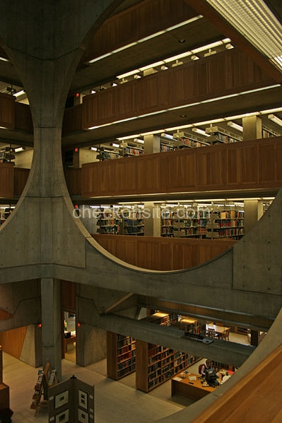
     We do our best to let our ‘pen pals’ know a little more about us every year.  This year, my dad wants to share a dish he’s had since he was a kid.  Earlier this month, they also gave us many of their own recipes; we plan to make each dish and enjoy them together over a video chat, as does each respective family.  To make the occasion all the more special, we are actually remodeling our dining area and have decided on a Napoleone dining set, a contemporary style which gained popularity back in the 2050s, long after its introduction some fifty years earlier.  It will sit in our old dining area, only the walls will be removed to give the effect of a larger and unrestricting space.  The angle of the floorboards is what will give the observer an idea of what is dining space and what is not.  Also, we are having an oculus built to put emphasis on the table as a symbol of union.  During the summer solstice, the sun will be at its highest point and the natural light can best be utilized.
     We will be connected to each other through video chats over the course of the meal.  Designers have actually taken this day into account when introducing concepts; many tables now have built in cybernetic outputs with wireless capabilities, not to mention having Skype as a key function.  Unfortunately, we still use the primitive method of interfaced nanofabrication to cover our web-chatting needs. 
     Distance has become irrelevant in our lives; where technology originally contributed to spread of social isolation, it has become our champion in this age of global solidarity.  


http://www.inmod.com/venezia-collection-napoleone-dining-table.html 

Sunday, February 13, 2011

RR5: Continued Traditions- Stroking the Ego

Tomb of Theodoric the Great


      The Tomb of Theodoric the Great is located in Ravenna, Italy for, as the name suggests, Theodoric, the king of the Ostrogoths.  The Ostrogoths are a Russian tribe that settled in what is today's Italy.  Theodoric was approached by the emperor, Zeno, to reconquer Italy in the name of Byzantium.  However, rather than handing the lands over to Zeno, he set out to reinstate Roman culture.  His introduction of Arianism further deepened the schism between his Ostrogoths and Byzantine society.


     Around the year 520 CE, the Great Theodoric built his own tomb in an area designated as the burial site for the Ostrogoths.  Based on the immense stones and arches used in its construction, it is quite likely that he had access to Syrian stone masons.  As a simple interpretation, it is important to point out that this structure predominantly employs circular and stacking formations.  The circle is an easy way to give importance to the space it encloses.  The stacking takes this circular form off the ground, giving it dominance over the surrounding area which it will overshadow.  Really, both of these techniques serve the purpose of stroking Theo's ego.


      The foundation of the tomb was constructed without the use of mortar or any wet cement.  The builiding rises up off of this platform in a decagon.  On four of these adjoining sides, rectangular cutouts were built with domed ceilings.  The interior of the building has a shape of a plus-sign.  The entire second floor opens up as a balcony.  Interestingly enough, there is no evidence of an access ladder or stairway leading up to this area.  This suggests that the second floor was the final resting place of the ol' king Theo.  The dome above this balcony is made of a massive, single limestone form. 


Scaled rendering.

Theodoric's Sarcophagus

BP5: a material melody.


Momentous, they rise,
Resonate in harmony,
Emote in rhythm.

Wednesday, February 9, 2011

babette's feast - theory 2

Recently, we watched a film called 'Babette's Feast'.  The story is focused around two Christian sisters living in the coast of west Jutland .  Their lifestyle is incredibly simple.  On a regular basis, they "dine" on bread and some sort of flat beer.  Sometimes, they even mix the two creating mush that is to absolutely die for!  No, in all seriousness, it didn't look like a fun time.  Even the architecture of the region is simple - nothing but small white houses and their thatched roofs. 

Nothing during this portion of the movie really drew my attention until a little ways in.  Enter Babette. When large scale bloodshed breaks out, she arrives as a Parisian refugee to serve as the sisters' housemaid.  Little do they know, she had once been a well-renowned chef in her city.  Never once did she complain about the conditions; in fact, she bore great gratitude towards the sisters for taking her in.  So when news arrived from France that Babette had won the lottery, she insisted on cashing it all in for a grand thank-you.  In the end, Babette was able to pull together a dining experience, the likes of which would never had seemed possible the townsfolk before.  She imported all the supplies from her old connections in Paris; only the best would do. 

When the time of the feast came, I was honestly taken aback by the huge turnaround that was their dining space.  Until now, we had become accustomed to seeing meager environments with wood bowls and tin silverware, not to mention splintering tables to match.  They way Babette's dining space was set up was truly beautiful.  All the lights in the room were doused, save four or five candles along the length of the table.  This seemed to bring all the focus to the table itself as a symbol of union.  That being said I believe that the true purpose of the movie is to understand the potential of any space.  That's how you inspire design!  Comprehend potential and you initiate progress.

Sunday, February 6, 2011

BP4: a testament to sir henry's big 3

"The end is to build well.  Well building hath three conditions: firmness, commodity, and delight."
- Sir Henry Wotten, The Elements of Architecture

In Friday's class, we took a second tour of our UNCG campus, but with a much better understanding of our surroundings.  This time, we discussed the buildings in relation to firmness, commodity, and delight.  Based on what we saw, I definitely feel that the library offers a space which best identifies with these three characteristics of a "well building". 

I feel firmness is a quality up for interpretation.  This could relate to the power and solidity that a structure could imply based on its aesthetics.  However, I believe that the quality I should be dealing with is the library's ability to stand the test of time. An excellent example representing the quality is the massive, circular stone entrance. 
view of library entrance. behold the majesty.


The library definitely fulfills its utility in the commodity department.  The point of this structure is to contain knowledge, in hard copy form, of course, and simultaneously provide a place in which students have designated areas to focus on their work. 
silly students working when they could be could be engaging in (illegal) college behavior..

For me, nothing absolutely stands out in our library besides the entrance and the sloping walkway to the EUC building, which is often the most exciting part of the journey.  In the end, it is just another generic library setup.  There is no ingenuity.  There is no heart.  As a lesson in delight, I give you Louis Kahn's Exeter Library.  A simple idea translated on a monumental scale.  It is an interior which welcomes the viewer and manages to create a feeling of belonging throughout the library, with its beautiful circles.  Lesson 2: In 2004, Rem Koolhaas designed the Seattle Public Library with a very unorthodox exterior.  The coming together of such large geometric shapes is magical at this scale and the cross-hatched texture further heightens this sense of grandeur.  Any given vantage point for either of these structures will absolutely hit you like a freight train of delight, filled with hamburgers.  It's that good!

Among Louis Kahn's Legacy. The Exeter.
Rem Koolhaas' modern approach. Seattle Public.

design manifesto of pure EPICness - theory 1

Over planning is the designer's demise.  In this world of uncertainty, it is not uncommon for control-freaks to exist.  They make futile attempts to determine how their everyday interactions will play out.  They try to set the agenda.  Translate this stressful lifestyle to a design project.  There would have to be a perfect method for carrying out the design process.  Most of the time would be spent on theory rather than practice.  In the end, you will only serve to hinder and frustrate yourself beyond belief.  So, my advice to you?  Cut loose.  You're trapped in a box. Break that sucker down!  Even if you start with a fairly vague and unfocused idea, it'll gain intent and direction through executing the design process, rather than wasting time with the naive illusion of control.

Revert to a childish state of mind.  A while ago, I read that children are closer to genius than anyone else, simply because they have not yet been tainted with wordly ideas.  So, please, discard your fanciful notions that life is carbon-based, gravity is a universal law, and that you like cats.  All you need to know is that the world is a magical and wonderful place.  RELEASE THE KID IN YOU.  Now, I unleash you upon society, free of your common-sense and knowledge which only served to tether you to rationality.  Be unpredictable.  Be unique.  That is your calling and your gift.  Go, my son/daughter. Go to Greatness.

Good work is not rushed.  Long have we suffered, my brothers, under the unforgiving heel of our academic masters.  These Professors seek to administrate our every action under pain of the 'F'.  Who gives them the power to designate the dreaded 'due dates'?  They act as if ordained by the gods.  But no more, my brothers.  This day we fight! This day we will decide of our own accord when assignments are finished; it is proven fact that rushed work is a fool's work.

Thursday, February 3, 2011

color week(s)


v

My take on spring and summer, using Color-aid paper.  For the spring, I kept it simple as its a time of rebirth and renewing the year.  As time goes on, spring matures into summer, allowing for richer hues of color (orange and some brown.)


The fall square is basically a study in contained chaos, reminiscent of falling leaves.  Winter, however, is a break from everything leading up to it.  All the growing richness and deepening hues up until fall are frozen over in the frigid color scheme I chose for that square.  The sharp edges remind one of the harsh and unforgiving tone of this season.